Last Friday I read about Zhenya Polosatova's blog. And I think it's very useful. :)
Organisation and Layout
Overall, the organization of the whole blog is very clear and well-organised. However, the home page shows 13 posts published by the author recently (if I don't count them wrong), which is a little too much. It may be better to reduce the posts displayed on the first page.
Another problem is that click the second and third subtitle below the picture on the home page, but there is no content in it. But click subtitle"About", the reader could get more information about the author.
Content and Features
This blog mainly shows the author's thoughts and reflections on language teaching and training. Sometimes, she will also share some PPT slides designed by the author herself or record the questions and answers with others. On the whole, they are closely related to English learning and training.
In every post, the key words will be written in bold or highlighted. Moreover, the author matches the post with interesting pictures which is related to the content, in order to not make the content look too boring and attract the eyes of readers.
Ease of use and Navigation
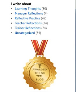
On the right side of the home page, navigation is classified not only by chronological order of publishing time, but also by specific content, which can make it easier for readers to find the content they want.


